Every HR leader knows what it feels like to drown in feedback. Dozens of survey links go out. Responses flood in, some detailed, some cryptic. The numbers look promising at first, but without context, they don’t say much. You scroll through spreadsheets, trying to make sense of the story behind the scores.
That uncertainty is the “before” state many teams live in. Disconnected data. Gut-driven guesses. Slow responses that cost both trust and time.
The “after” looks very different. Picture a dashboard that doesn’t just collect results but translates them into meaning. It highlights where engagement dips, where culture is thriving, and where intervention can make the biggest difference. It helps you move from assumptions to awareness.
According to Gallup only 31% of U.S. employees feel engaged at work. That gap between knowing something’s wrong and knowing what to fix is where dashboards create their biggest impact.
The following section explores what these dashboards actually do, and why they’re fast becoming indispensable for modern HR teams.
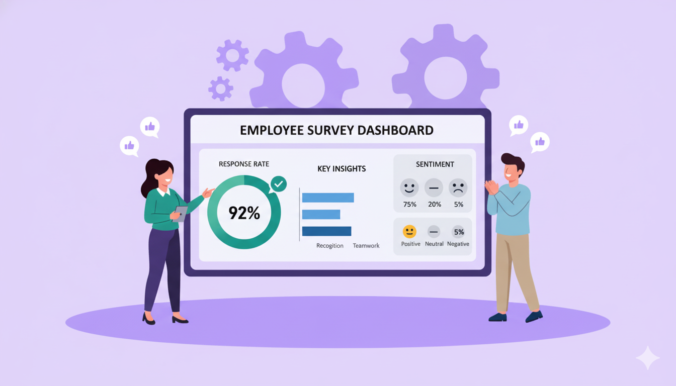
What Does an Employee Survey Dashboard Do?
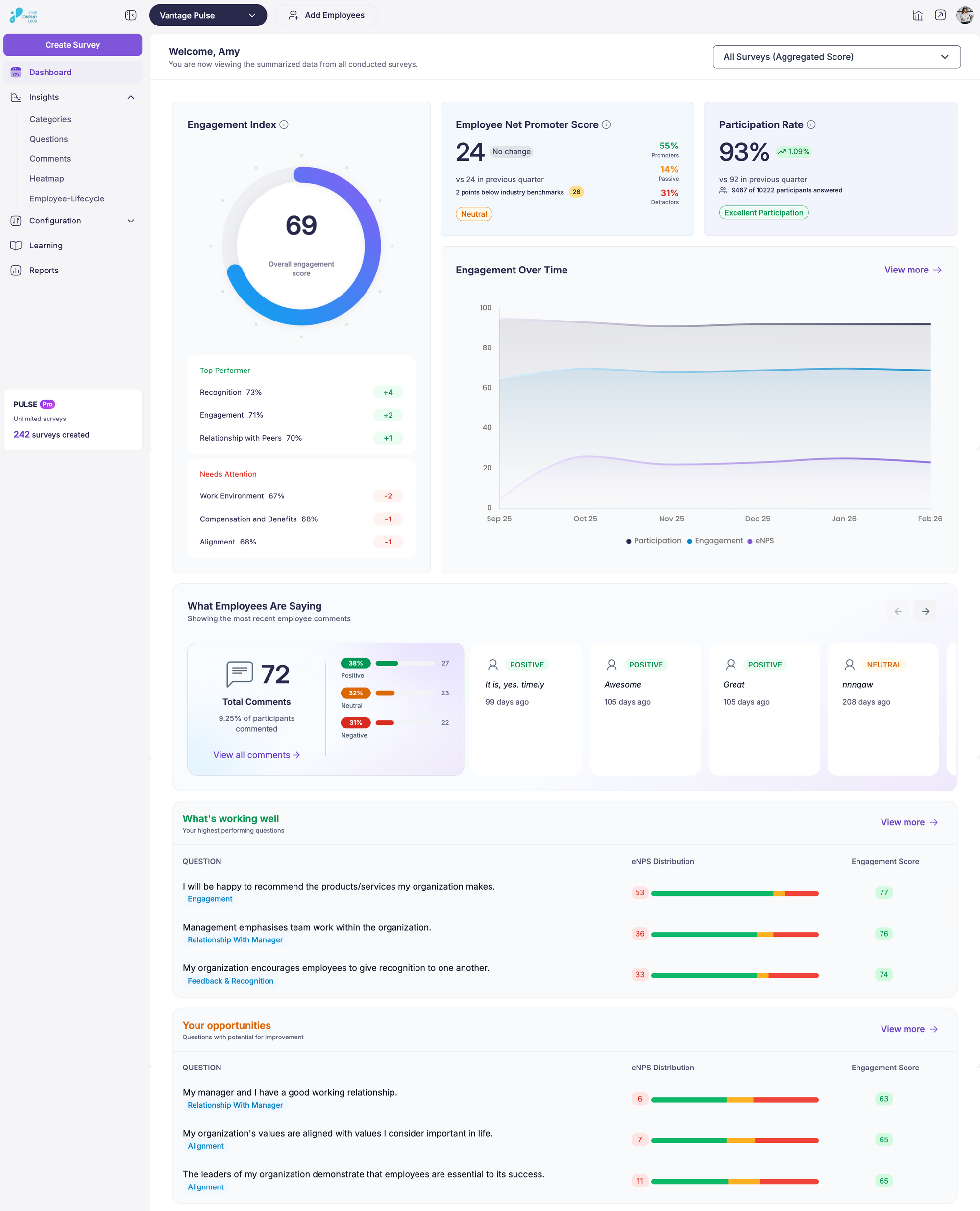
Source: Vantage Pulse
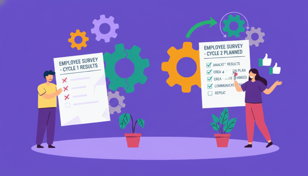
Feedback collection in organisations began in earnest during the 1920s, when industrial companies started using worker-attitude surveys to track morale and working-conditions sentiment. Back then, HR teams relied on paper-based forms and manual compilation. Today, a specialised employee survey dashboard brings that capability into modern HR practice with speed and scale.
Core Functionality
A well-built employee survey dashboard acts as HR’s control center, the single place where scattered feedback turns into something coherent. It helps leaders stop chasing numbers across spreadsheets and start reading a clear story about how people feel, perform, and stay connected.
- Data aggregation
The dashboard gathers responses from every touchpoint, annual surveys, pulse surveys, onboarding feedback, even kiosk submissions, into one unified system. Instead of juggling Excel sheets or digging through email attachments, HR teams see all input aligned on one screen.
- Visualization
Numbers on their own rarely inspire action. Dashboards translate data into visual cues, heatmaps that spotlight satisfaction gaps, line graphs that reveal engagement trends, and comparison charts that show how teams evolve over time. Visual clarity saves hours of manual interpretation.
- Real-time monitoring
Feedback loses impact when it arrives months later. A dashboard updates as employees respond, giving HR a live pulse of morale. It’s like watching the organization’s heartbeat, steady when employee engagement is strong, fluctuating when issues start brewing.
- Drill-down capability
Surface averages hide stories. A powerful dashboard lets leaders zoom in from company-wide sentiment to the micro-level: departments, regions, or tenure bands. This helps identify where recognition programs work and where leadership intervention is needed most.
- Alerting and benchmarking
Dashboards can set intelligent thresholds. When engagement or satisfaction drops below the defined level, the system flags it. Benchmarking adds another layer, letting HR compare internal data to past surveys or industry standards from sources like Gartner or SHRM.
Features Not Provided by All Survey Tools
Most survey tools display response rates and averages, which offer only a limited picture. A well-designed employee survey dashboard digs deeper, showing what drives those numbers and why they change over time. The features that follow distinguish standard reporting systems from those built to support meaningful decisions.
1. Sentiment Analysis that Understands Context
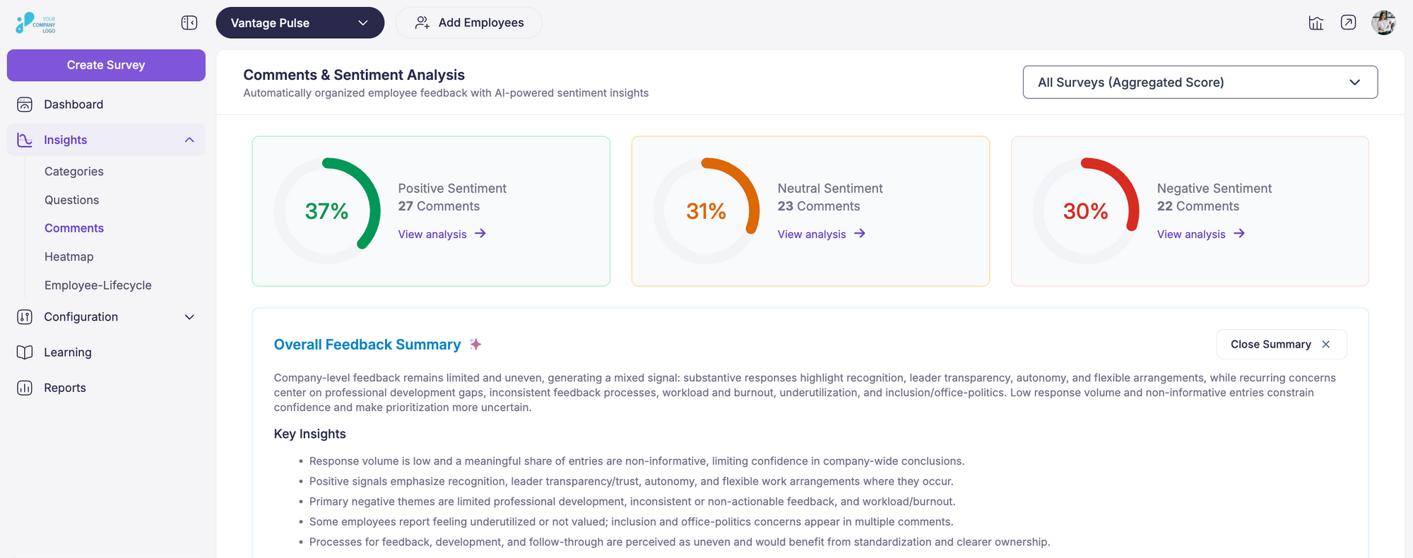
Source: Vantage Pulse
Modern dashboards can interpret the language employees use in open-ended responses. They identify tone and emotion, helping HR spot trends in how people feel, not just what they rate. Research found that organizations tracking employee sentiment saw an 18 percent rise in productivity and up to 40 percent lower turnover. When a team’s scores remain stable, but sentiment turns negative, the system flags it before morale begins to decline.
2. Role and Region Based Filtering
Not every insight should be viewed in a single bucket. Dashboards that allow filtering by job level, department, or geography help leaders see patterns unique to each group. This matters because engagement drivers for a warehouse team in Texas often differ from those for a remote tech team in Seattle. HR dashboards that track key workforce metrics such as turnover and labor costs make it easier to understand how these variations affect overall performance.
3. Integrated View Across HR Systems
Integration is a long-standing challenge for HR teams. A report noted that 51 percent of HR professionals believe their HR technology is not well integrated, which leads to fragmented insights and duplicated effort. When survey dashboards connect with HRIS, learning, or performance systems, they build a complete view that links engagement data with retention and skill development.
4. Predictive Indicators for Early Warnings
Predictive analytics help identify risks before they surface. Incorporating this capability into a dashboard allows HR teams to detect early warning signs, such as declining participation rates or spikes in negative sentiment about leadership.
5. Lifecycle Mapping for Employee Experience
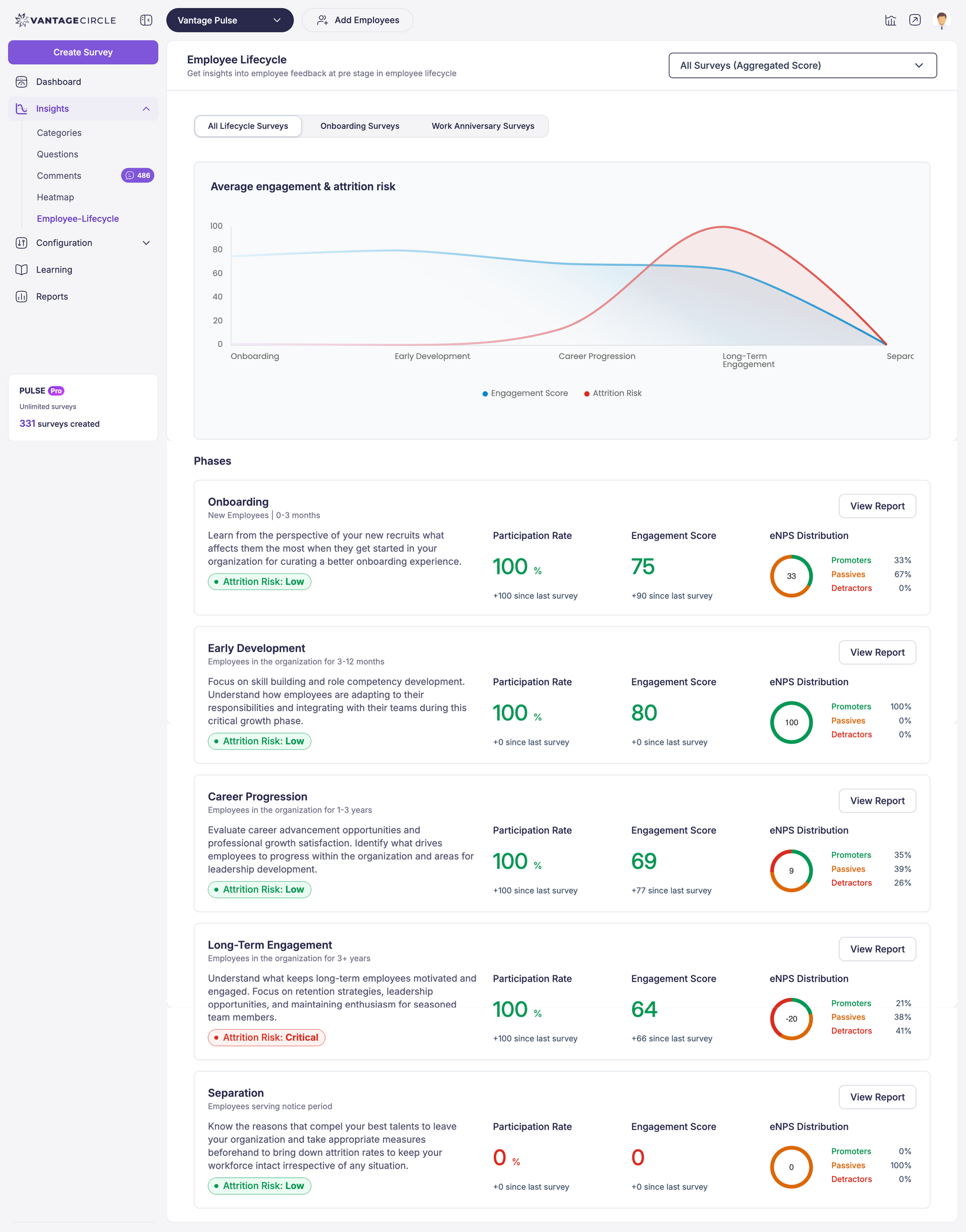
A mature dashboard can visualize how employee sentiment evolves from onboarding to exit. This lifecycle view highlights when engagement tends to drop, such as after the first year or during restructuring periods. Tracking those patterns helps HR refine touchpoints that strengthen the employee experience over time.
6. Built-In Action Tracking
Collecting data is only valuable when it leads to action. Dashboards that include built-in action tracking enable managers to assign responsibility, monitor progress, and close the feedback loop. This feature reinforces accountability and ensures that employees see visible changes after sharing their feedback.
When these capabilities work together, an employee survey dashboard becomes more than a measurement tool. It turns continuous feedback into an ongoing system of learning and improvement for the organization.
10 Key Metrics Every Dashboard Should Include
A dashboard is only as good as the metrics it tracks. The right data points help HR leaders translate feedback into focused action instead of chasing vanity numbers. Each organization’s priorities may differ, but certain indicators form the backbone of an effective employee survey dashboard.
1. Employee Engagement Score
This score reflects how emotionally and mentally connected employees feel to their work and organization. Engagement metrics serve as the primary barometer of workplace health. According to Gallup, engagement sits at 31 percent among U.S. employees, showing that most teams still have untapped potential. Tracking this score over time highlights whether your culture initiatives are improving commitment and discretionary effort.
2. Participation Rate
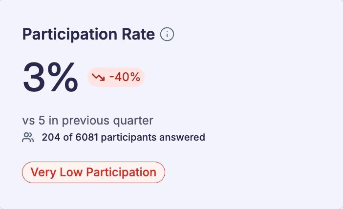
High response rates strengthen the reliability of survey results. A consistent participation rate above 70 percent is considered healthy across industries. When participation drops, it can signal survey fatigue, lack of trust, or weak communication from leadership. Monitoring participation by department or location helps ensure feedback represents every voice.
3. eNPS (Employee Net Promoter Score)
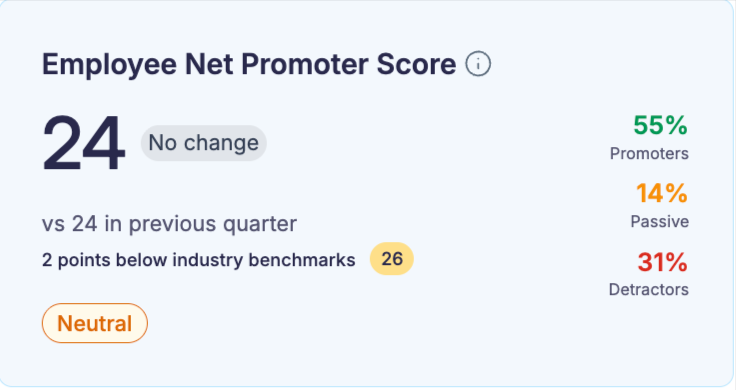
Derived from the well-known customer NPS model, eNPS measures employee advocacy, how likely someone is to recommend their company as a workplace. A positive eNPS (above 0) indicates more promoters than detractors, while leading organizations aim for +40 or higher. Tracking eNPS trends reveals whether employees are becoming advocates or disengaged critics.
If you want to learn more, check out our blog on eNPS
4. Manager Effectiveness
Managers play a pivotal role in shaping employee experience. Studies show that relationships with managers account for nearly 70 percent of variance in team engagement. Dashboards that isolate manager-related questions or sentiment help HR detect where leadership coaching or support is needed most.
5. Turnover Risk Indicators
Correlating engagement or satisfaction data with exit trends turns a dashboard into a forecasting tool. For instance, employees who mark low scores in recognition, growth, or manager communication often show higher turnover probability within three to six months. Linking survey data with HRIS exit data exposes patterns before attrition accelerates.
6. Sentiment by Theme or Category
Beyond numerical averages, dashboards that categorize comments by topic, such as workload, communication, inclusion, or well-being, help HR understand the story behind the scores. For example, a stable engagement score might mask growing frustration around workload balance. Sentiment analysis adds an emotional dimension to quantitative data.
7. Diversity and Inclusion Metrics
Incorporating demographic filters such as gender, age, and ethnicity ensures fairness and transparency in how experiences differ across groups. Reports from McKinsey (2023) found that companies in the top quartile for gender diversity on executive teams were 39 percent more likely to outperform financially. Tracking belonging and inclusion indicators helps organizations identify where representation and equity need attention.
8. Remote Work Experience Index
Hybrid and remote work have reshaped engagement dynamics. Dashboards that separate metrics for remote, hybrid, and on-site employees uncover experience gaps that may not appear in overall averages.
9. Well-Being and Burnout Scores
Employee well-being directly impacts productivity and retention. According to Deloitte’s 2024 Well-Being Report, 52 percent of employees feel emotionally exhausted, while only 43 percent believe their organizations support their mental health adequately. Dashboards that track wellness survey questions, such as stress levels or work-life balance, allow HR to adjust workloads, policies, or wellness initiatives before burnout affects performance.
10. Open Feedback Volume and Sentiment Shift
The volume of open comments and their sentiment trajectory help gauge communication openness. A sudden drop in comment volume may indicate fear of speaking up, while consistent positive sentiment signals psychological safety. Monitoring this balance ensures the organization maintains a culture of trust and continuous dialogue.
How to Build or Customize a Dashboard
Building or customizing an employee survey dashboard doesn’t have to be complicated. With the right setup, HR teams can create dashboards that actually make sense, tools that show what’s happening across the organization and help you act on it. The goal is to make data work for you, not the other way around.
1. Choose the Right Platform
Start by picking a dashboard platform that connects easily with the tools you already use. Look for one that syncs with your HRIS, performance management software, or payroll system. When your dashboard pulls data from multiple places, you get a clearer view of how employee feedback links to business results.
2. Select Your Metrics
Once your platform is ready, decide what you want to track. Common metrics include:
- Engagement score
- Employee Net Promoter Score (eNPS)
- Turnover risk
- Manager effectiveness
- Employee well-being
Don’t just copy a standard setup. Adjust the metrics to match your company’s priorities. If you’re hiring fast, focus on onboarding sentiment. If you operate in multiple regions, track engagement or satisfaction by location.
3. Segment Your Data
The power of a dashboard comes from how you can slice the data. Filter by department, role, location, or tenure to spot patterns. Maybe one team shows low engagement or a specific region reports higher burnout. These insights help you take targeted action instead of guessing what’s wrong
4. Set Up Feedback Channels
Your dashboard is only as strong as the data feeding it. Give employees multiple ways to share feedback, such as:
- Quick pulse surveys for regular updates
- Kiosk or mobile surveys for on-the-go responses
- 360-degree feedback for well-rounded input
More feedback channels mean more reliable insights. You’ll see trends you might miss if you rely on one type of survey.
5. Customize for Your Needs
Make the dashboard reflect what matters most to your organization. If employee well-being is a priority, highlight data on stress levels, workload, and work-life balance. If leadership growth is your focus, track manager effectiveness and engagement trends. Many platforms let you filter by time frame, team, or location, so you can tailor the view to any audience.
6. Make It Actionable
A good dashboard doesn’t just display numbers—it drives action. Include tools to assign tasks, track progress, and follow up on survey results. When managers can see what needs attention and what’s improving, they’re more likely to act quickly and consistently.
Tips for Aligning Dashboards with Business Goals
- Connect to KPIs: Link your dashboard metrics to real business outcomes. If your goal is to reduce turnover, connect engagement scores to retention data.
- Keep It Current: Review and update your metrics as business needs change. Outdated data leads to outdated decisions.
- Design for Ease: Build a dashboard anyone can use, whether they’re in HR or the C-suite. A simple layout and clear visuals make insights easier to understand and act on.
Using a Pre-Built Dashboard within a Survey Platform
When time or resources are limited, pre-built dashboards can be a practical shortcut. They’re designed to deliver instant insights without the setup hassle that comes with building a dashboard from scratch. For many HR teams, these ready-made tools provide everything needed to monitor engagement, satisfaction, and performance in one place.
1. Instant Access to Key Insights
Pre-built dashboards, such as those in Vantage Pulse, give HR teams immediate visibility into core metrics. With engagement, satisfaction, and manager effectiveness already configured, you can see a complete picture of employee sentiment right away. There’s no need to spend hours fine-tuning charts or reports before the data becomes useful.
2. Simplified Data Interpretation
Instead of digging through spreadsheets or exporting results, pre-built dashboards do the heavy lifting. They display survey data through visuals like charts, heatmaps, and trend lines, making it easier to spot patterns and shifts in engagement. For example, if engagement dips in one department, HR can identify it quickly and respond before issues escalate.
3. Built on Proven Best Practices
Pre-built dashboards are often built using metrics that have already been tested across industries. They focus on what matters most, engagement, satisfaction, and turnover risk. Vantage Pulse uses this approach, offering dashboards that align with standard HR goals while still providing the flexibility to drill into the data that matters most to your organization.
4. Smooth Integration with Existing Systems
These dashboards typically connect easily to your existing HR tools. Vantage Pulse, for instance, integrates with HRIS platforms, performance management systems, and other HR software. That means employee feedback flows automatically into one centralized view, helping HR teams spend less time managing data and more time acting on it.
5. Real-Time Insights and Faster Action
Pre-built dashboards often include real-time tracking, allowing HR teams to see trends as they happen. Instead of waiting until the end of a survey cycle, you can monitor engagement changes and respond quickly. With Vantage Pulse, HR teams can identify rising issues or improvements immediately and take action when it counts most.
6. Scalable for Growth
As your organization expands, a pre-built dashboard helps you stay consistent. You can monitor feedback across multiple teams, locations, or business units without losing visibility. Vantage Pulse makes it easy to manage data across different groups and maintain alignment with company goals as the organization grows.
5 Common Challenges
Employee survey dashboards can reveal valuable insights, but using them effectively takes more than turning on the tool. HR teams often face a few common roadblocks that can limit how much value they get from their dashboards. Recognizing these challenges early helps ensure the data turns into meaningful action.
1. Misinterpreting the Data
One of the biggest challenges is drawing the wrong conclusions from what the dashboard shows. Numbers don’t tell the full story without context. A sudden drop in engagement, for example, might seem like a problem within a specific department, but it could be caused by something external, such as seasonal workload changes or company-wide restructuring.
To avoid misreading the data, HR teams should combine quantitative results with qualitative insights. Pair survey numbers with open-ended feedback, manager observations, or even external benchmarks. This broader view helps confirm whether the trends on the dashboard truly reflect what’s happening across the organization.
2. Too Much Data, Not Enough Focus
Dashboards can display dozens of charts, metrics, and filters, all useful, but not all equally important. When HR teams try to interpret everything at once, it can lead to analysis paralysis.
The best approach is to focus on what matters most. Identify a few metrics that connect directly to your HR or business priorities. For example, if turnover is a concern, prioritize engagement, eNPS, and exit survey data. Filtering out the noise helps HR teams stay focused on insights that actually drive results.
3. No Clear Follow-Up
Even the best dashboards lose value if the insights don’t lead to action. Seeing a low engagement score means little if there’s no plan to improve it. Without a clear follow-up process, the data becomes a report that’s quickly forgotten.
To fix this, HR teams should build structured follow-up steps into their workflow. Create action plans directly tied to specific dashboard findings, and track progress regularly. If engagement in one team drops, schedule check-ins, launch a feedback session, or set a leadership development initiative. Turning insights into next steps keeps the dashboard relevant and useful.
4. Low Stakeholder Buy-In
Sometimes the challenge isn’t the data, it’s getting people to believe in it. When senior leaders or managers don’t trust or understand dashboard insights, they’re less likely to act on them.
HR teams can address this by showing how dashboard insights connect to real business outcomes. Present data in leadership meetings, link it to KPIs, and share examples of improvements driven by past feedback. When stakeholders see that dashboard insights lead to measurable change, buy-in naturally follows.
5. Inconsistent Data Quality
Reliable insights depend on reliable data. Low survey participation, inconsistent formats, or incomplete responses can distort results and lead to poor decisions. For example, if certain teams consistently skip surveys, their perspectives go unheard, and the overall data becomes skewed.
Improving data quality starts with encouraging consistent participation and standardizing how surveys are conducted. Set up regular checks to validate data before it’s pulled into the dashboard. This helps ensure the results represent the full organization and not just a fraction of it.
How to Overcome These Challenges
- Train Your Team: Provide HR professionals with training on reading and interpreting data, understanding sentiment analysis, and linking insights to company goals.
- Set Clear Objectives: Align every dashboard metric with a specific business or HR objective. Clear goals make it easier to know what to track and why.
- Build a Feedback Loop: Establish ongoing review processes. Track action items, monitor progress, and keep revisiting dashboard results to see what’s working.
- Involve Stakeholders Early: Include leaders in discussions about dashboard goals and data interpretation. Use real examples to show how data can guide smarter decisions.
- Maintain Data Quality: Work closely with IT and operations teams to ensure accurate, consistent data flow. Regularly review participation rates and data inputs to keep insights dependable.
Conclusion
Employee survey dashboards give HR teams a practical way to turn feedback into action. By bringing all survey data together and visualizing it in real time, these tools help HR professionals spot trends, uncover problem areas, and make informed decisions that directly improve engagement and company culture.
Still, the dashboard itself isn’t the solution, the action that follows is. The value comes from consistently reviewing the data, connecting it to business goals, and taking deliberate steps to improve the employee experience.
When HR teams use dashboards effectively, they gain more than just reports. They gain a system for listening, responding, and continuously improving how people work and feel within the organization. A well-used dashboard becomes not just a measurement tool, but a foundation for building a more connected and engaged workforce.

This article is written by Sahil Khan. People, culture, and what makes employees genuinely engaged, I write about it all, with practical insights HR teams can actually use.
Connect with Sahil on LinkedIn.